Slate List of Applications
- When you click on the First Departmental Review bin you are initially brought to a list that looks like this:

- This view is very uninformative, so first click on the little yellow icon on the far right that is next to “Default”, see below:

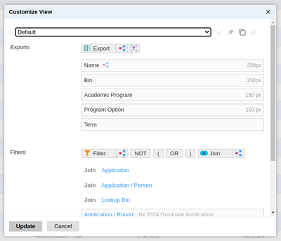
Three options come up, click on the first one called Customize View.

From the dropdown select Mathematics PhD or Mathematics Masters. There is also Mathematics Review, which lists extra info about the number of ratings per applicant and the average rating per applicant. You can choose whichever you wish.
- Now the list view should look something like this:

You can sort by any column, by clicking on the column header. There is a way to filter but it is more complicated. So I’ve included those in separate filtering instructions.
-
The Faculty Interest column is the top 3 choices of who students may wish to work with. They can choose up to 6 but we only have room to display 3. You can find a full list in the application itself.
-
To view the file of any application that interests you, there is a faint paper icon at the end of each row. Simply click on that.
